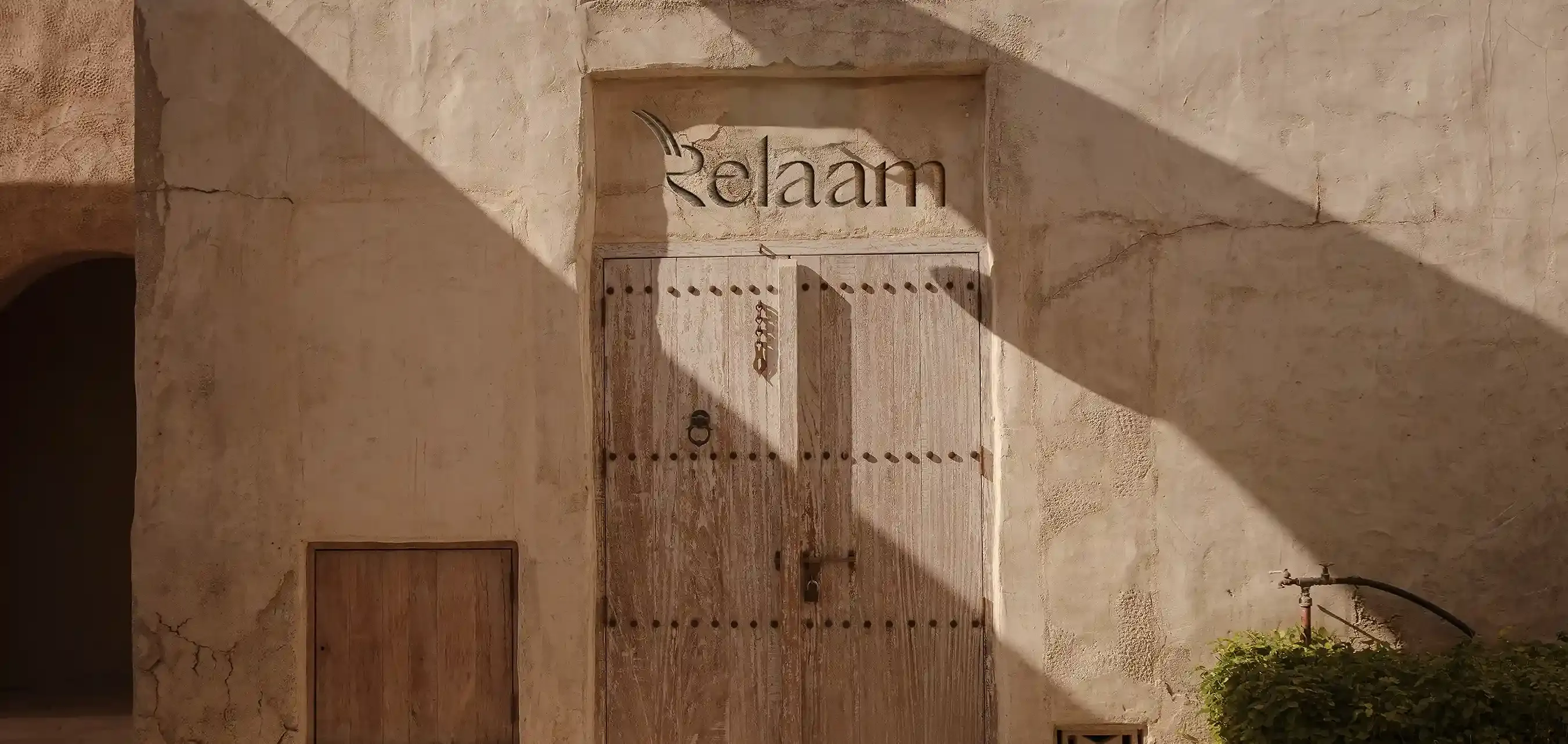

THE REBRAND
This new chapter reflects the transformation we’ve experienced as a company, as a team, and as part of a fast-growing Abu Dhabi.
Relaam carries our legacy forward into a smarter, more connected, and future-ready experience. Our renewed name, identity, and commitment are shaped around the people we serve, the partners we support, and the future we are building together.
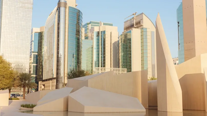
Abu Dhabi's rapid growth called for a brand that matches its pace. Relaam reflects the city's ambition and our role within it—offering real estate services that are intuitive, digital-first, and designed for the way people live and work today.

Our operating model has evolved to meet rising expectations powered by smarter tools, streamlined systems, and a people-first mindset. From landlords and tenants to owners’ associations, we continue to strengthen the way we serve. At the heart of this growth is a deeper commitment to meaningful connection. Every interaction is shaped to deliver clarity, care, and excellence.
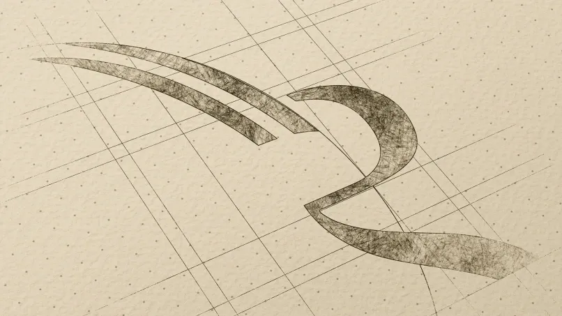
Relaam’s logo is a visual bridge between our heritage and our forward-looking vision. Inspired by the UAE’s natural landscape and the Arabian oryx, the design blends earthy desert tones—brown, beige, and red—with the spirit of a modern Abu Dhabi. The elegant, sculpted wordmark reflects our confidence and clarity, while the upward stroke of the ‘R’ symbolises growth, momentum, and purposeful progress.
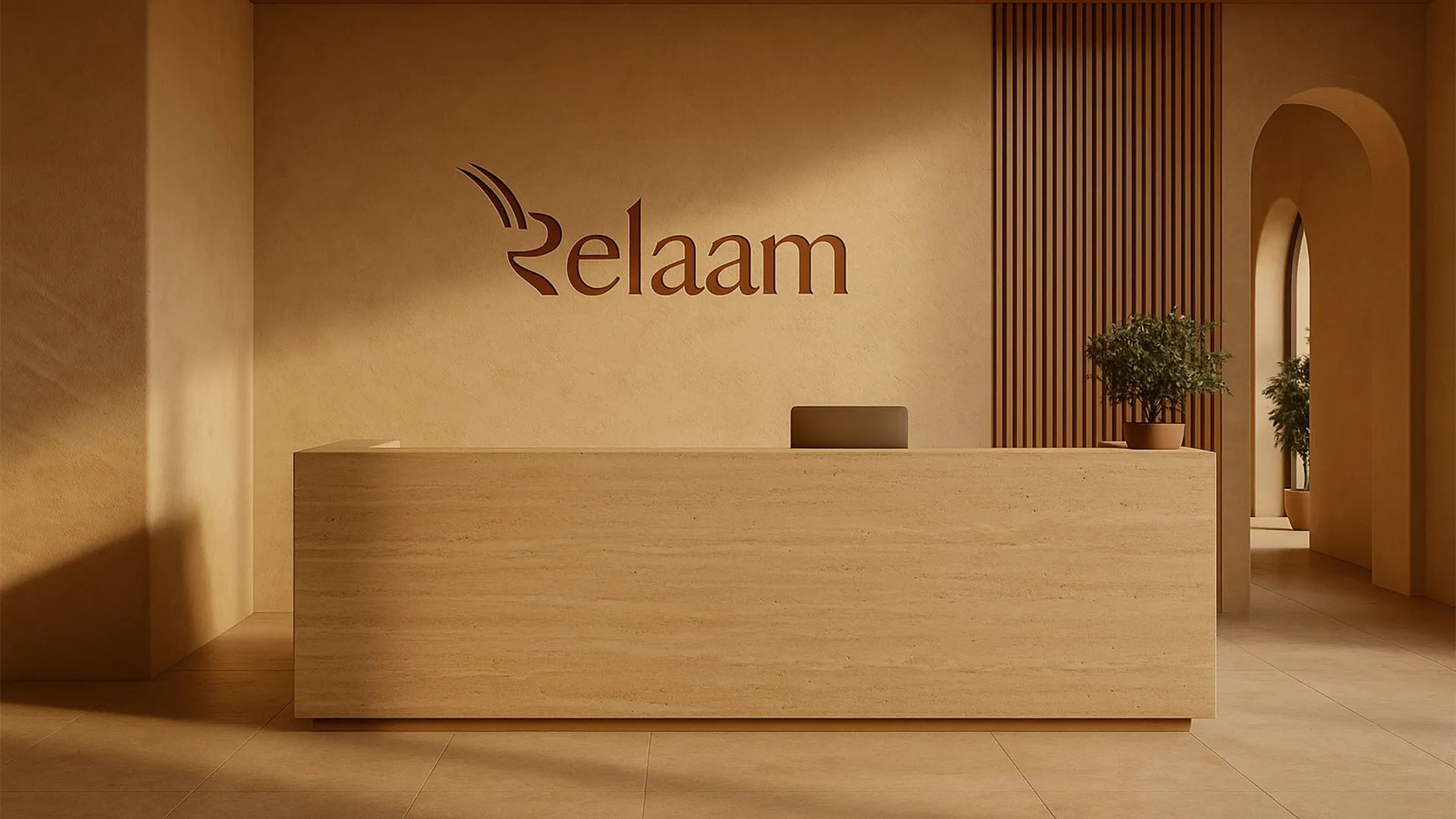
A new name. A fresh identity. Smarter systems. Better tools. A clearer voice.
We’ve redesigned the way you interact with us, on-line, on-site, and everywhere in between.
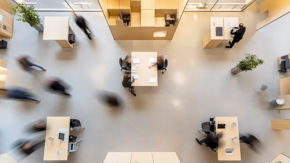
Our values. Our team. Our commitment.
The same trusted team continues to lead this next chapter, carrying our legacy forward with pride and purpose, now strengthened by top market talent to drive innovation and reinforce our commitment to a smarter, better future.